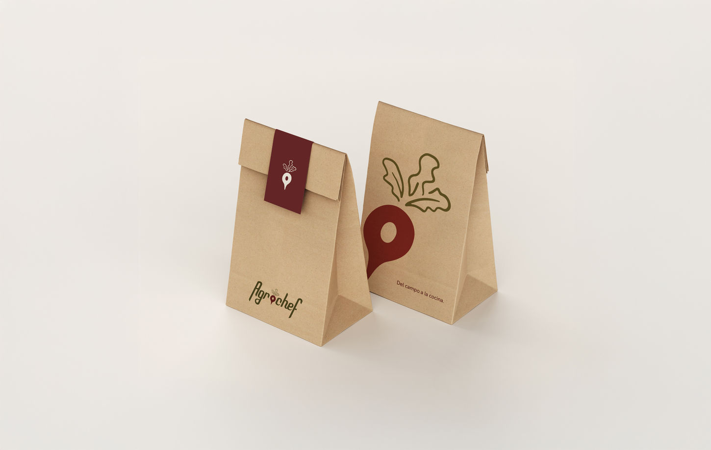
Agrochef
Agrochef is a fresh-produce delivery app that connects users to high-quality fruits and vegetables at the tap of a screen. For this brand, we developed a comprehensive strategy, tagline, and visual identity rooted in simplicity, agility, and trust.
The custom typography is distinctive and intentionally non-replicable—modern, sans-serif, and subtly dynamic. Its upward strokes convey motion and energy, while the clean, straight lines suggest efficiency and reliability. This balance of movement and structure reflects the brand’s core values: speed, freshness, and dependability.
The Agrochef icon cleverly fuses a radish with a geolocation pin, symbolizing both the freshness of its products and the tech-driven logistics behind the app. This duality captures Agrochef’s essence: natural produce delivered through smart, seamless technology.
Retail
Panama City
Branding
2019


